class="tag"Posts Tagged ‘artistic sign’
Artistic Sign Design – MARSALA Is The 2015 Pantone Colour Of The Year
Muted Marsala
Earlier this week Pantone announced that Marsala is the 2015 Colour Of The Year.
This is a big step away from last year’s Radiant Orchid, and the brighter tones from the past few years.
While last year’s Radiant Orchid had us conjuring up images in our heads of Kelly Osbourne’s coif, this year Marsala steps in and the colour reminds us of how much we loved hearing Ricardo Montalban speak about corinthian leather.
We would describe Marsala as a muted colour, that could easily blend with earth tones an well as neutral hues. This colour does not have the intense pigment of the colours in recent years so this shade will be a great compliment to many artistic designs.

Many times an understated colour can help your message stand out. As you can see in the picture above, Marsala gives a great contrast to the message on the image without having to give the punch of a bold primary colour.
When it comes to artistic sign design we believe your colour choice is a huge factor when it comes to complimenting your comany’s brand. Colour makes a statement in your business logo, but the choice of colour in the logo design can say far more than you may have realized. By having a professional signmaker suggest colours for your signage, you will have confidence knowing that your business sign will stand out without being an eye-sore.
For more information on how we can work with you on an artistic sign, be sure to visit our CONTACT US page. We are always looking to connect with our audience. We want to know what you think of MARSALA as Pantone’s choice for the 2015 colour of the year. Leave a comment below, send us a tweet or comment on this post on our facebook page!
An Artistic Sign For Director Ivan Reitman’s Montecito Restaurant
Need An Artistic Sign? Who You Gonna Call?
We were thrilled to get the call that we had been chosen to manufacture an artistic sign for Ghostbusters director Ivan Reitman’s Montecito Restaurant in Toronto Ontario.
As mentioned in the Ottawa Citizen article Montecito, it is named after his production company, and can be found in the heart of Toronto’s entertainment district. It will be located close to the Toronto International Film Festival hub the TIFF Bell Lightbox. With TIFF releasing their 2014 film lineup earlier today the timing is just right for the opening of Montecito.
Bringing Something Unique To The Area
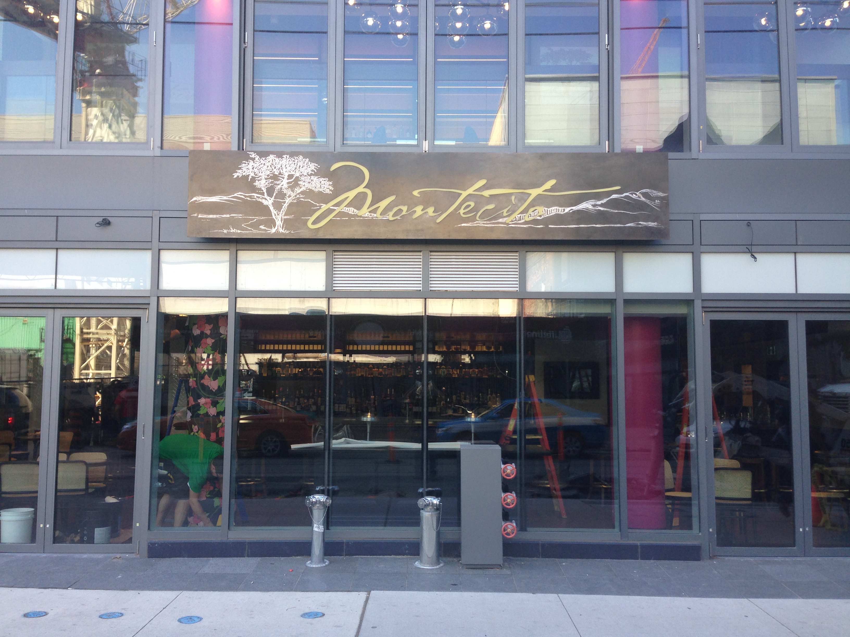
Restaurant co-owner Jonathan Waxman took a unique approach to the fare being served and will focus the menu around Canadian sourced ingredients. We also took a creative approach and created a sign as unique as the restaurant itself. Finding a way to bring artistic elements to a metal sign can be quite a challenge, but by using a few creative sign-making techniques the project came together nicely. It began with a metal sign with a dark distressed-look finish to resemble patina (otherwise know as a weathered material).
The restaurant’s graphic logo resembles the trees in this ariel shot of Montecito California
and in order to make it a focal point for the sign the image was hand engraved into the metal sign.
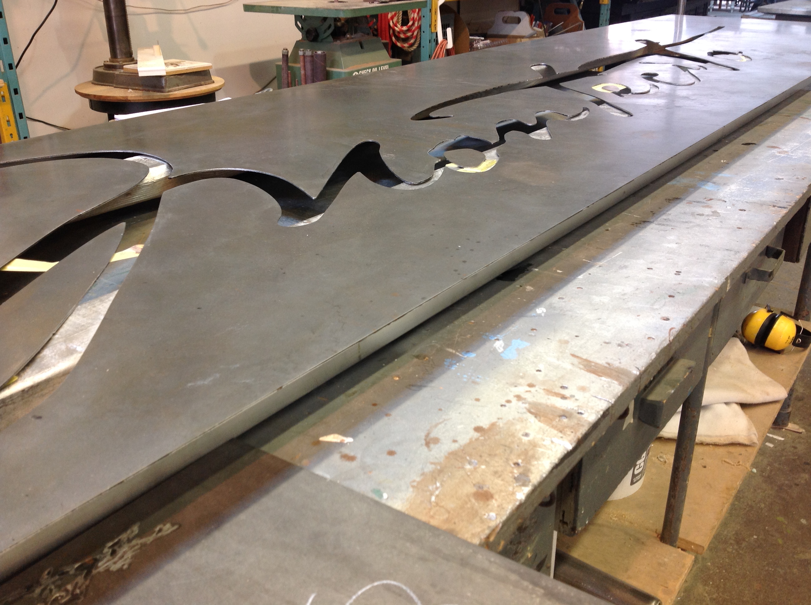
Additionally the name Montecito was cut out of the sign to leave room for the amber lit LEDs to shine through. The sign was then installed on the exterior of the building to let customers know that they are now open for business.
Recipe For Success
The upscale atmosphere for the restaurant in the artistic entertainment distric of Toronto will be a great fit, but they aren’t taking themselves too seriously. See what we mean in the Toronto Star article where you can see a Ghostbusters inspired recipe for a Staypuff dessert.
Looking for an artisitc sign for your business? Be sure to visit our CONTACT US page and let us know we have peaked your interest! By sending us the size, shape, text you require we can get a custom sign quote off to you right away!
Artistic Sign Design – Finding The Font
Find The Font That Fits
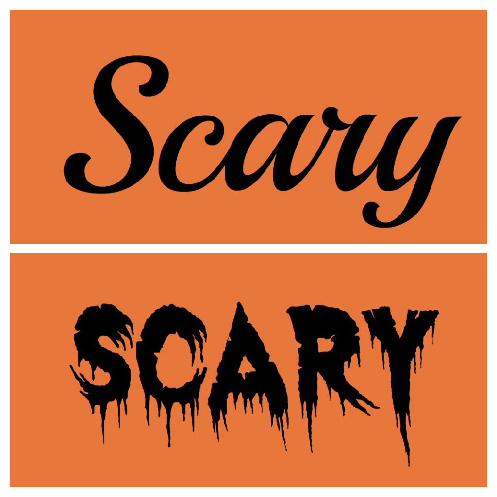
There are so many factors when it comes to artistic sign design. Logo colours, graphics and text are all important elements of custom sign creation. With all these variables it is often the choice of font that helps unify the overall look of the sign. When it comes to displaying company names and branding messages it is important to find a font that fits.
Favorite Fonts For Designers
We took to twitter and asked our followers what their favorite fonts are.
What is your favorite #Font ? #design — The Sign Depot Inc (@TheSignDepot) June 26, 2013
As you can tell by typography fan responses there are lots of great fonts to choose from. We were then asked about the favourite fonts of The Sign Depot. Below are choices from our experts in sign design.
Peter’s Picks
Peter is the Owner/President of The Sign Depot Inc. If you come by our workshop many of the signs and artistic sculptures on display were created by Peter.
- Fute Bold
- Garamond
- Snell Bold
Ben’s Picks
Ben is the head of our vinyl department and also goes by the nickname of the Vinyl Master. He know how to best display all your window graphics, vehicle decals, and temporary signage
- Euro
- Flash
- Aura
Adam’s Picks
Adam is our Lead Designer. If you are looking for custom business signs, logo design and/or sign package consultations, Adam is your guy. Watch for upcoming posts about Adam’s design work.
- Geared Slab
- Lobster
- Duke

Custom Vintage Look Wood Signs – Truth Beauty’s Business Sign Solutions
The Beauty Of A Distressed Wood Sign
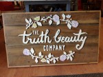
When it comes to Business Sign Solutions we have lots of options to suit a company’s branding. Finding that perfect fit may take more than one type of material to make the establishment recognizable in busy areas. When the The Truth Beauty Company moved from their Olivier location, they took the opportunity to create custom business signs for this new business.
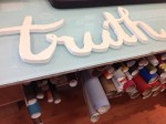
Their store front sign and reception sign was fabricated from repurposed wood to give the signs a vintage look. To add dimension to the custom signs, High Density Urethane (sign foam) letters and designs were CNC cut on our Router table. Those HDU pieces were given custom finishes and then attached to the distressed wood and framed. This gave the Truth Beauty sign 3 dimensional sign elements while keeping with the antique look of the wood.
Add Some Artistic Signage
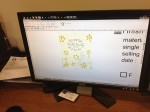
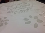
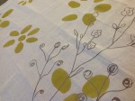
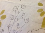
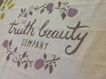
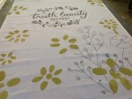
In addition to the exterior entranceway sign and interior sign and additional artistic fabric wall hanging was created to further showcase the business’s logo. A stencil was cut to match the design and applied to the fabric. Next the design was airbrushed on the material and after the stencil was removed the result was an artistic sign in the form of custom piece of drapery for their location.
To read more about The Truth Beauty Company make sure to check out their article in the Waterloo Chronicle aptly named The Truth About Beauty.
Source: waterloochronicle.ca via Lisa on Pinterest
To learn more about The Sign Depot’s custom signs and business sign solutions take a look at our portfolio page and be sure to contact us.
Looking for more engaging ways to connect with Sign Depot? Make sure to subscribe to our monthly newsletter that highlights our recent sign projects and upcoming sign features. You can also follow us on Facebook, check out our Sign Depot Pinterest page or send us a tweet! Have an inquiry specific to this post? Make sure to leave it in the comment section and we will make sure to act swiftly to answer it for you.

