Archive for the ‘artistics signs’ Category
Custom Painting And Creating One Of Kind Artistic Signs
Are You Unique?
Being a custom sign shop we are always looking for unique ways to create custom artistic signs. Many of our signs have custom paint finishes to make them a one of a kind sign. Custom painting is something that has had a cultural impact throughout history and is still carried over to modern day.
Custom Sign Painting
The crew here at The Sign Depot had the opportunity to view the film Sign Painters, which was glimpse into the world of handpainted signs. (FYI there is a swear word or two in this trailer- don’t say we didn’t warn you).
SIGN PAINTERS (OFFICIAL TRAILER) from samuel j macon on Vimeo.
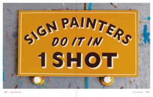
The film showed how historic sign painting techniques are still used today, but the real star of the film is 1 Shot Paint, something we use almost daily here in our workshop.
But I am sure all of our expert sign makers will agree with what the painter in the trailer said “I want to make signs that turn into art”
Spray Painting With Airbrush Techniques
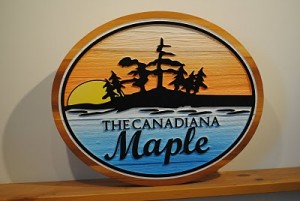
Another great custom painting technique is airbrushing. We often use it for backgrounds on our custom wood signs. This paint finish can provide overall coverage or colour fades just like the skyline in this cottage sign below.
Airbrush techniques are often used in several variations of street art as well.
From the Las Vegas Strip
To a very popular graffiti artist
To learn more about how street artist Bansky pranked passers-by in Central Park take a look at the Colossal post about the Unannouced Art Sale (a big thanks goes to Unmarketing’s Scott Stratten for bringing this amazing post to our attention!)
Even we have taken to spray painting techniques outside the shop. Below is a time lapse of stencil and spray paint sign technique (you can see it happening mid-way through the video) and although we don’t get many opportunities for this kind of sign work we always jump at the chance to try something new.
Creating A Custom Look
The expert sign makers here at The Sign Depot have several other custom sign painting techniques to ensure your sign has a unique finish and creates an impact. If you are looking for something vintage and weathered, or modern with a high gloss finish, they can achieve a one of kind look for your artistic sign. Once you have an idea of your sign project be sure to visit our Contact Us page in order to receive your quote. Looking for more ideas? Search around our website, blog, facebook page, and pinterest boards for some inspiration.
Artistic Sign Design – Finding The Font
Find The Font That Fits
There are so many factors when it comes to artistic sign design. Logo colours, graphics and text are all important elements of custom sign creation. With all these variables it is often the choice of font that helps unify the overall look of the sign. When it comes to displaying company names and branding messages it is important to find a font that fits.
Favorite Fonts For Designers
We took to twitter and asked our followers what their favorite fonts are.
What is your favorite #Font ? #design — The Sign Depot Inc (@TheSignDepot) June 26, 2013
As you can tell by typography fan responses there are lots of great fonts to choose from. We were then asked about the favourite fonts of The Sign Depot. Below are choices from our experts in sign design.
Peter’s Picks
Peter is the Owner/President of The Sign Depot Inc. If you come by our workshop many of the signs and artistic sculptures on display were created by Peter.
- Fute Bold
- Garamond
- Snell Bold
Ben’s Picks
Ben is the head of our vinyl department and also goes by the nickname of the Vinyl Master. He know how to best display all your window graphics, vehicle decals, and temporary signage
- Euro
- Flash
- Aura
Adam’s Picks
Adam is our Lead Designer. If you are looking for custom business signs, logo design and/or sign package consultations, Adam is your guy. Watch for upcoming posts about Adam’s design work.
- Geared Slab
- Lobster
- Duke

Gold Leaf And Custom Artistic Sign Making
Go For The Gold
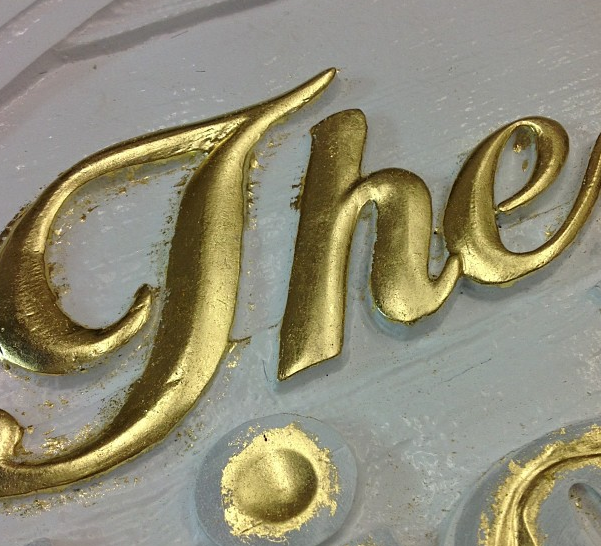
One of the custom sign making techniques that we get a lot of inquiries about is the application of gold leaf. There is no substitute for the shine achieved by 23K gold leaf. It is multiple step process which requires a lot of expertise in order to properly apply the gold leaf to a sign or artistic sculpture. The best example of well known gold leaf application recognized worldwide would be the Queen’s Flotilla. To learn more, you can read our post Fit For A Queen, to see how The Royal Barge was sculpted using many of the same techniques that we use right here in The Sign Depot Workshop.
See The Sign Making Steps
-
First Gold Size Oil is applied. Gold size is an adhesive that is applied to the surface of where you want the gold leaf to be.
-
Next the sheets of Gold Leaf are separated to ensure even application.
-
The Gold Leaf is applied with a specialty brush
-
The last step is letting it set. In order to ensure the longevity of the finish, you must make sure the Gold Size Oil and Gold Leaf are completely dry before moving the sign.
Below you can see a quick recap of how we apply gold leaf to our custom signs. It adds quite an artistic touch to the finishing process.
Custom Sign Making Techniques
Curious about other custom sign making techniques? We have a fix for that! Be sure to RSVP to the upcoming Sign Depot Demo Day by clicking the image below. There you will get a behind the scenes look at what goes on in our sign manufacturing workshop. Peter Moir and the staff of The Sign Depot will be on hand to answer any questions and you’ll be amongst some of the top marketers in the business industry.
Artistic Signs Of Intelligent Life
Maryse Maynard Exhibit – Signs Of Intelligent Life
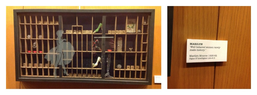
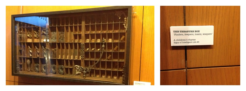
The City Of Kitchener Rotunda Gallery is featuring an exhibit called Signs Of Intelligent Life. Of course with the words signs in the name it peaked some interest. The exhibit was artistic mix medium show. It displayed printing press racks as shadow boxes influenced by famous sayings and quotes. It was an artistic sign showing a visual of the how the words influenced artist Maryse Maynard. You can read more about the artist and the ideas behind Signs Of Intelligent Life on her artist statement post.
Artistic Ideas
The words in these art pieces were displayed using scrabble pieces, clay tiles and what looked like routered wood letters. Below are two pieces that show how the phrases were created with Scrabble letter tiles.
Out Of The Box Thinking
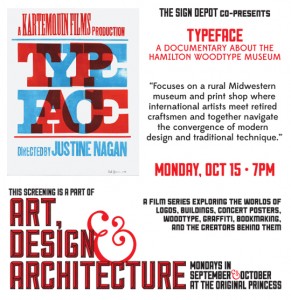
The use of printing press tile boxes reminded me of the TYPEFACE film we presented last year at the Princess Cinema and how the skill of Wood Type printing could have been lost if it had not been for a Museum trying to keep it alive. Through the movie you learned how new artists are choosing to use wood type printing in new pieces, and in the case of this exhibit the item that holds the wood type letters was re-purposed into an artistic piece.
This brought me back to The Sign Depot workspace where Peter has an antique typeface holder displayed in his office. Every time I look there is an addition of items no longer available nowadays. Separately they look like items from days gone by, but together they look like a collection. It is almost as if these items are being re-purposed to make a brand new art piece right here in our workspace.
Looking at it now I wonder what phrase Maryse Maynard would choose for this display? Many come to mind for me, but I think the one that stands out is
Everything Old Is New Again
Artistic Signs, Sign Supplies, Street Art and Sign Depot at SGIA
Let the Networking Begin – SGIA Expo 2012
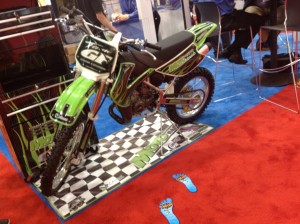
Las Vegas was a whirlwind of excitement and the SGIA Expo had a lot to do with it. Sign Depot was invited to attend the SGIA Expo at the Las Vegas Convention Centre, and I knew I needed to make the most of it. It is not very often that you are surrounded by thousands of people in your industry, including suppliers, attendees and leaders in the Sign and Print Industry. Navigating my way through the crowd was the easy part. Finding ways to leave an impression on those I spoke with was what I set out to do.
The video above was only half of the crowd. I was on a landing and there was a second level of the show behind me. The SGIA Expo was an enormous trade show with over 22,000 people registered and I was determined to get Sign Depot’s custom artistic signs on the radar of those in attendance.
Finding Your Niche
To get a good feel for the show I started by visiting some of our equipment suppliers. I found out what they had planned for new year and to see what new products would be available to Canadian Sign Shops. Knowing all the new materials that would soon be available gave me a good idea on how Sign Depot could incorporate their new items into our artistic signs. We always strive to be sign innovators because we want your custom sign to stand out and be noticed.
I also asked the suppliers what most attending the show were looking for info wise so I could be ready to converse about the hot topics happening at SGIA. With a good idea of what those at the SGIA Expo were looking for, I was off and running. Well, not running but ready to network my way across the sign industry.
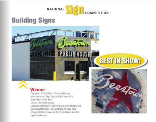
Interestingly enough many had heard of Sign Depot and the work that was happening at our Kitchener Ontario workshop. It was the article in Sign Media about the Award Winning Beertown Sign that made us recognizable in USA. Not only was it a great jumping off point, I was able to elaborate further about the custom signs Sign Depot manufactures and how working with our wholesale sign department could bring them a whole new revenue stream. This was of interest to many and I found my ID badge being scanned for further contact info over and over. Knowing the niche market I was targeting made all the difference.
Finding The Fun
All work and no play would take all the fun out of artistic sign making. Choosing to stay on top of trends and looking for new sign innovations is fantastic but a little outside inspiration can go a long way. So I decided to take it to the streets!
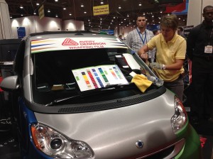
Watching some of the live demonstrations reminded me of the Sign Depot workshop. It is always great to see those in the sign industry show their skills, but after the SGIA Expo I decided I needed some real outside inspiration too.
Where else but Las Vegas can you find artists creating right in front of you?
They say What Happens In Vegas, Stays In Vegas but I think these signs are meant to be displayed for all to see. I think you may recognize a few.
But it seems where ever I go, I always manage to find a pirate ship.
Do you attend conferences and events in your industry? Let us know your experiences. Leave a comment below, send us a tweet, or post your comment on our facebook page. We want to know if it made an impact on your business.
Artistic Singer, Artistic Design and What they Have in Common With Signs
Signs, Designs and How Bob Dylan Brought it All Together
Bob Dylan is often referred to as artist of a generation. His unique sound and thought provoking lyrics have been heard by many but what brought Dylan to the mainstream audience was the clip of his song Subterranean Homesick Blues in the film Don’t Look Back. During the clip Bob Dylan uses several of rudimentary signs to grab attention to the messages in his song.
Flash forward to present day. Film and video are still ways to express a message and Bob Dylan is still influencing others. Take a look at how his lyrics influenced one designer to re-create the signs and messages from the original film clip, using several styles of artistic typography.
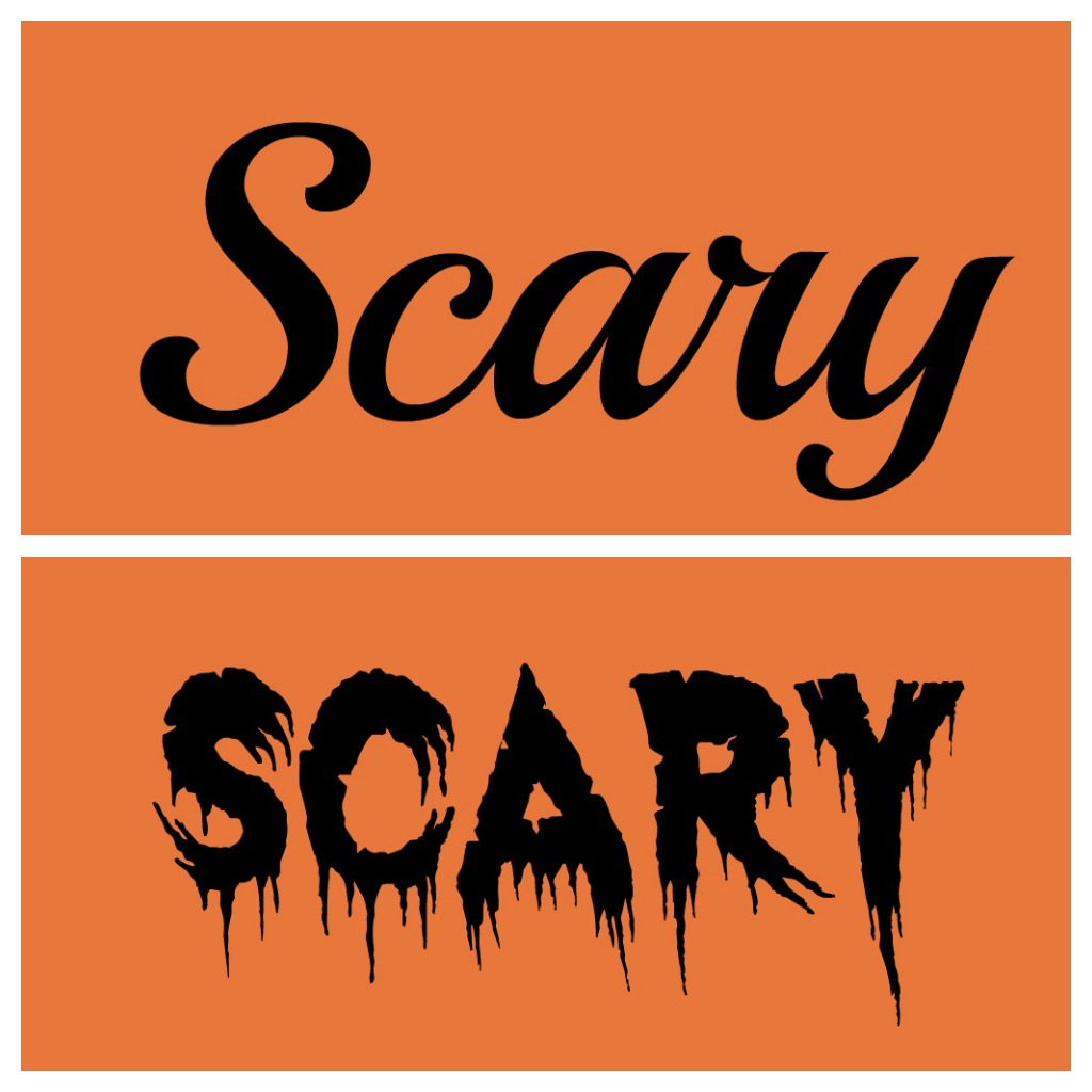
http://vimeo.com/49556689The video is a great representation of how fonts play into relaying a message. Finding a lettering style that matches what you want to convey is something that designers do very well. They choose the font that best tells your story and fits your brand. Here’s a great example of the word scary displayed in two different fonts.
The choice of font makes a bigger impact in the lower photo because it also displays the feeling that goes along with the word. Your artistic font choice gives your text a voice. Make sure to consider what your text says when picking a font. It can put emphasis on the message you want others to read and understand.
Finding Fonts Fascinating?
Then join us at the screening of the TYPEFACE Film. Happening October 12 2012 at 7pm in Waterloo Ontario’s Princess Cinema.
Watch the trailer on our post The Sign Depot Presents Typeface and purchase your tickets.
Becoming a fan of fonts? See how to use them in artistic sign design from both a signage point of view in the links in this posts and look for upcoming blogs on the topic.
Where Web Design and Custom Signs Meet
The Founding of #FontFanFriday
Connecting with designers is something we always do regularly here. We enjoy seeing the works from Building Designers, Interior Designers, Web Designers, Graphic Designers or anyone that loves artistic design. Over the past few months we have been conversing with Amanda Wood Web Design over our mutual love of Retro Sign Design. Soon after when The Sign Depot and The Princess Cinema announced we would be partnering to present the TYPEFACE film, we realized we also had the same fondness as Amanda for fonts.
Finding the right font that fits your needs is something that many individuals struggle with. Choosing a script that suits your brand identity is something best left to a professional. Although your personal preference is always considered, a great designer will know what best represents your business. They will find font to incorporate you and your company that is complementary to the style of your logo.
After a quick poll on the facebook page it was apparent that everyone has a different favorite font. The font that few did agree on was Futura Bold.
The description of the Futura Bold font from Adobe is as follows
Designed by Paul Renner in 1927, Futura is the classic example of a geometric sans serif type. Its original concept was based on the Bauhaus design philosophy that “form follows function.” Futura uses basic geometric proportions with no weight stresses, serifs, or frills, with long ascenders and descenders that give it more elegance than most sans serif typefaces. The wide range of weights plus condensed faces provide a variety of ways to set short text blocks and display copy with a strong, no-nonsense appearance.
Looking to find a favorite font? This is where we come in. Today marks the beginning of the #FontFanFriday. Every Friday follow @AmandaHWood and our twitter @TheSignDepot to see what design fonts we’re chatting about. Join the converstation and let us know what fonts tickle your fancy. Need some inspiration? Check out our You’re So Fonty Pinterest Page. Who knows perhaps your favorite font may already be on one of our custom wood signs.
What artistic fonts would you design with? Let us know by tweeting with #FontFanFriday hashtag, repinning a font that you’re a fan of, or leave a comment below about your font of choice.
Custom Car Creations for Cutegecko
Start With A Blank Canvas and See Where Artistic Vehicle Graphics Can Lead You
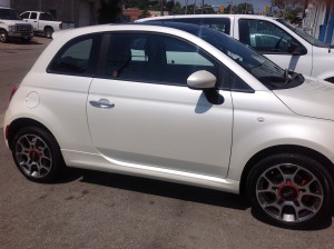
To start vinyl vehicle graphics the best jump off point is a clean car, without any markings or dirt to hinder adherence. When it looks fresh you will be able to picture what you want on your automobile and where you want it placed. This is how the concept for the Cutegecko Design Agency began.
As you have may have noticed in earlier posts, Karl & Amy of Cutegecko Inc. are great #B2B partners here in our community. We love working with designers to transform their designs into artistic signs. This time we were applying their logo and lettering to their new car. Once they provided us with their design concept, it didn’t take long for Ben, our vinyl master to get to work on colour matching and vinyl plotting. Their Fiat was made into a mobile branding billboard in no time flat.
Make A Mobile Masterpiece
It is important to remember that your car travels where you travel. It is really important to let it represent you and your business. Driving a rusty clunker is not the best way to display your professionalism. Finding a way to stand out from your surroundings is always the way to go. Would you notice this driving by?
Find What Drives You
What would make you stand out? What would your vehicle look like with vinyl graphics? Would you want window decals? These are just some of the questions that Karl & Amy asked themselves when they came up with their ideas. You can read about what they learned over on their post for Promotional Vehicles.
We Have The Answers
If you still have questions on the best way to brand your company car, make sure to contact us. We’re here to help from concept to completion. Who knows you might get to Hi-Five our vinyl master too!
Signs That The Olympics Are Near and What They Share With Artistic Signs
London 2012 Olympic Games
Friday July 27, 2012 is the official start to the London England Olympic Games. In an earlier post it was mentioned that the London Olympic Games Design Font would be a trend for 2012. Now that we have reached the beginning of this year’s games there are a few more items that should be noted when speaking about the upcoming Olympics. Many of the ideas behind this year’s event are along the same lines as best practices for custom signs.
Design
The London Olympic build was custom designed with sustainability in mind. Permanent venues were sites that were refurbished to accommodate the games. Temporary venues were custom designed so that once removed there would be very little disruption to the area where they were constructed. Knowing what you want your design to accomplish is something the designers at The Sign Depot always have in mind
Be Memorable
Structure is one thing, but you need to be memorable as well. Art In The Park area near the Olympic Park will be noticeable to everyone attending the games. This area will surely find it’s way into many pictures/tweets/status updates in what is deemed as the most “social” Olympics yet. Creating a buzz and being noticed will be things to watch for during the 2012 Olympic events. Those will be the memories that will live on after the torch has been put out.
Make A Bold Statement
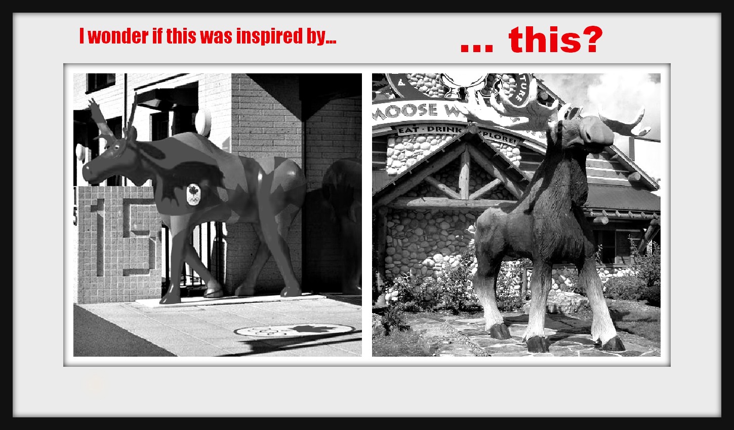
Being a Canadian company we definitely endorse this video! Finding ways to stand out from your competition is always the way to rise to the top. Choosing unique and artistic ways to convey messages through signs is something we defintely have in common with the London 2012 Olympic Games. Finding ways to be bold with sophisticated style is not and easy task but taking risks and stepping up to challenges are traits that we find commendable.
We even wonder if our post on Findabilty inspired the Canadian Olympic Team
Award Winning Artistic Signs
Canadian Creativity Index
Last week it was announced that Kitchener Ontario is one of Canada’s Top Ten Creative Cites. Finding ways to be artisticly creative are always at the top of the list here at Sign Depot. Knowing that we are established in city that is on the Canadian Creativity Index makes us proud members of our creative community.
Award Winning Signage
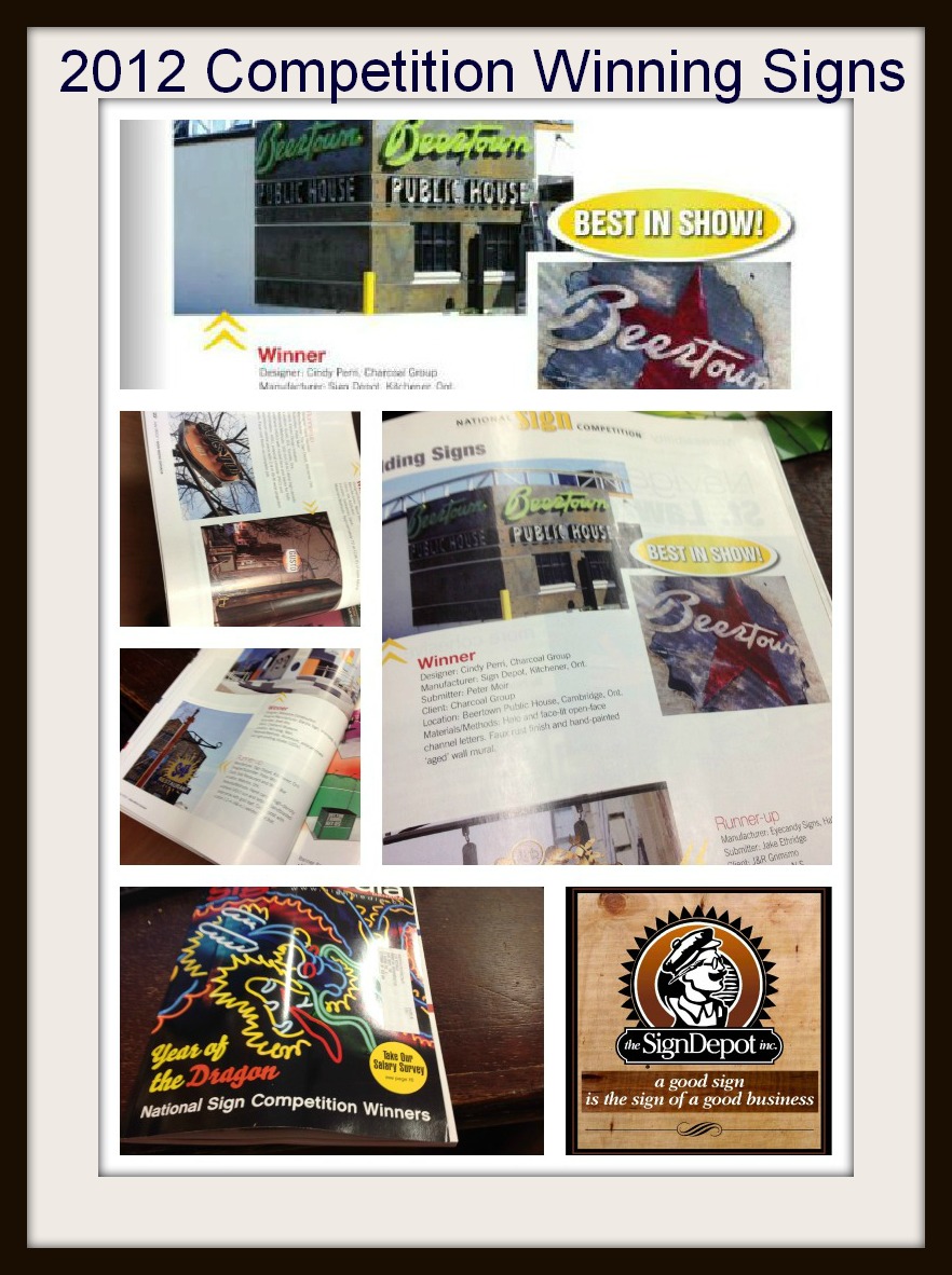
To double the creativity celebration Sign Depot was awarded BEST IN SHOW for the 2012 Sign Media Canada Competition.
As seen in the July 2012 issue of Sign Media Canada, the top publication for signage in Canada.
The judges–members of Sign Media Canada editorial advisory board–had to consider each entry’s merits in terms of originality, creativity, appearance and design suitability. Together, the selected winners in nine categories, with the entry earning the highest overall score also honoured as best in show.
Beertown Sign Wins Best In Show
The Beertown sign had all the elements that the judges were looking for, and as mentioned in an earlier post that sign had many elements to it. Finding it out was first place in Canada is something Sign Depot takes a lot of pride in.
But wait there’s more…..
We also received recognition as the runner-up sign company in two other categories.
The sign for Gusto 101 was the runner-up for top illuminated sign, and Sole Restaurant and Wine Bar received the nod as runner up for Stand-alone sign.
Now with this year’s competition over, we’re back to work creating projects to enter in next year’s Sign Media Canada competition. Who knows what custom signs we’ll create for the remainder of 2012 but if you need a creative stand out sign for your business make sure to contact us! You might be the owner of the next award winning sign.
We want to celebrate this success so we’re having a BBQ for the Food Bank Of Waterloo Region! Bring some cans and get a burger! Sounds like a plan to me. To find out more about what we are creating make sure to subscribe to our newsletter , which can be found at the top right of our blog posts. To chat more about the artistic community send us a tweet, or leave a comment on facebook.

