class="tag"Posts Tagged ‘Colour Of The Year’
Pantone Gets Lively as it Introduces Living Coral as the 2019 Colour of the Year
Living Coral in Living Colour
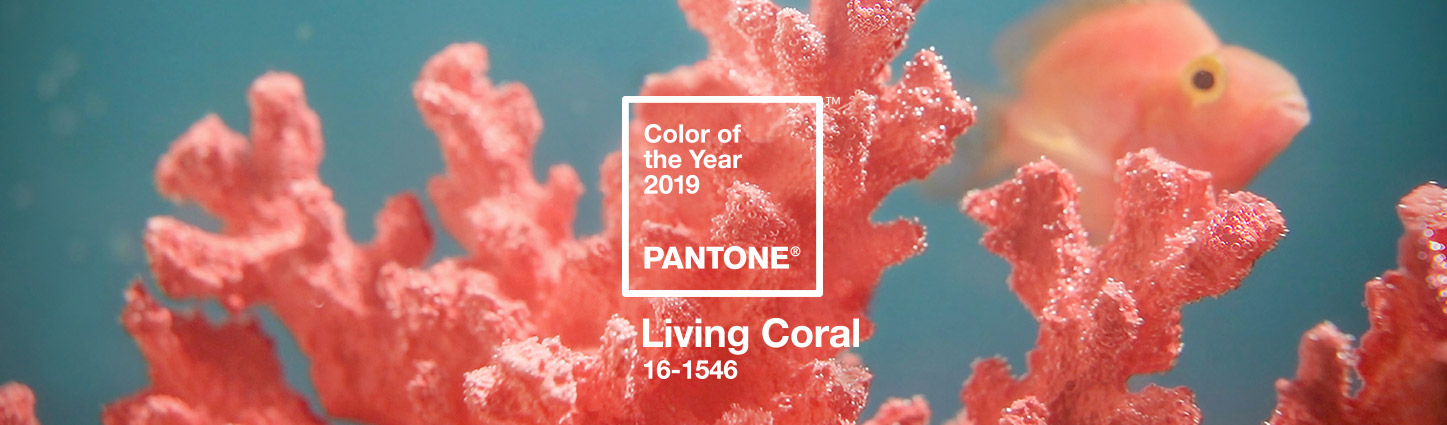
In a stark contrast from last year’s Ultra Violet, this year Pantone has chosen Living Coral as their 2019 Colour of the Year. They describe it as
An animating and life-affirming coral hue with a golden undertone that energizes and enlivens with a softer edge
The video above shows how well it can flow into living world under the sea.
They go on to say
PANTONE Living Coral is evocative of how coral reefs provide shelter to a diverse kaleidoscope of color
This makes the colour easy to implement into colour schemes and designs. If you are looking to mix this trend into your branding, then signage is a great place to start. As mentioned in our earlier post, 2019 will be the year to #StepUpYourSignage and choosing this lively colour is great way to refresh your brand in the coming year. Here at The Sign Depot we are thinking of it as a mix of 2012’s Tangerine Tango and 2015’s Marsala. This makes Living Coral the perfect cross section of orange tones to add vibrancy to your signage.
Ways To Add Living Coral To Your Signage Mix
There are two ways to go about adding new colours to your signs. You can either start subtle by changing some of your window graphics, vehicle decals and/or A-frame signs then changing the rest as you see fit, or you can be bold and rebrand your company signs all at once. The first choice makes for a smooth transition, while the second choice makes a big impact. When you decide the choice that best suits your business we are hear to help. All it takes is a visit to our CONTACT US page to connect with one of our sign experts. They can provide you with a free quote and get your company on trend for the upcoming year. Want to know what else we think is trending? Follow our Twitter, Facebook, Instagram and Pinterest feeds to find out.
Purple REIGNS Again With The Announcement Of Ultra Violet As The Pantone 2018 Colour Of The Year

Purple Reigns Supreme Once Again
Today Pantone has announced that its 2018 Colour of the Year is Ultra Violet. We think that the popularity of 2014’s purple hue Radiant Orchid and now with today’s announcement, that Purple Rain, oops I mean purple reigns the colour palette. As stated on the Pantone website,
Musical icons Prince, David Bowie, and Jimi Hendrix brought shades of Ultra Violet to the forefront of western pop culture as personal expressions of individuality.
With inspirations like this, be on the lookout for Ultra Violet popping up everywhere.
via GIPHYPerhaps even in 2018 artistic sign design projects. We are always looking ahead and this colour is sure to spark creativity with many in the design industry.
Trendspotting For 2018
As each new year begins so do new trends. Many follow trends in different industries. Some follow fashion trends, others follow tech trends and most of us follow food trends.

Here at The Sign Depot, we follow design trends, but we also like to create trends with our custom signs. When it comes to creating trends in the signage industry we always try to partner vintage looks with new tech or give sleek design an edgy look. There are always ways to incorporate signage into your brand strategy and with this bright bold colour trending, Ultra Violet and its complimentary colours can add new life to a dated look.
Now Is The Time To Start Building Buzz About Your Business
Being on trend also means that your company is creating buzz about the business. You want to be as standout in your industry and make yourself unique in the marketplace. Now is the time to put your 2018 marketing plan into action and start building buzz about your business. Get a jump on your competitors by connecting with us to discuss how we can help elevate your brand with custom signs.
Artistic Sign Design With Pantone’s 2017 Colour Of The Year – Greenery
‘Tis The Season
As in prior years, designers await an early December announcement from Pantone. It’s an announcement that does set a “tone” for the next year. Yesterday the wait ended as Pantone announced it’s upcoming Colour Of The Year. The choice for the 2017 Pantone Colour Of The Year is GREENERY.
It’s perfect timing as our last post was about selecting cedar trees as Christmas trees and we think adding some green is always a great idea. It’s a colour we often incorporate into our artistic sign design for our seasonal products.

Going Green For 2017
With Greenery making it’s way to the forefront of Pantone’s extensive colour list, we expect to see it incorporated into logo designs and branding strategies very soon. The new year is a fantastic time to plan a re-brand or launch advertising campaign, and a fresh colour like Greenery will add vibrancy to branding and marketing initiatives. Finding ways to stay ahead of competitors is something that needs to be planned months in advance, so now is the best time to decide if your business should go green for 2017. One of the best ways to get ahead of the pack is to update your company signs. If you are not sure where to start when it comes to signage, just visit our CONTACT US page to be connected with The Sign Depot’s artistic sign design team. They can assist with ways to incorporate this colour and complimentary shades into your branding, exterior business signs and retail signage. If you already have your designs in place we are able to work with that as well. Many well known design firms come to the sign-makers here at The Sign Depot for their expertise in creating signs that match their design work. The Sign Depot’s artistic sign designers and sign-makers understand the creative process. From concept to design to manufacturing the approved signage, they can produce a high quality representation of your business.
Do you plan to incorporate the Pantone’s Colour Of The Year GREENERY into your business for 2017? Let us know in the comments.
Artistic Sign Design – MARSALA Is The 2015 Pantone Colour Of The Year
Muted Marsala
Earlier this week Pantone announced that Marsala is the 2015 Colour Of The Year.
This is a big step away from last year’s Radiant Orchid, and the brighter tones from the past few years.
While last year’s Radiant Orchid had us conjuring up images in our heads of Kelly Osbourne’s coif, this year Marsala steps in and the colour reminds us of how much we loved hearing Ricardo Montalban speak about corinthian leather.
We would describe Marsala as a muted colour, that could easily blend with earth tones an well as neutral hues. This colour does not have the intense pigment of the colours in recent years so this shade will be a great compliment to many artistic designs.

Many times an understated colour can help your message stand out. As you can see in the picture above, Marsala gives a great contrast to the message on the image without having to give the punch of a bold primary colour.
When it comes to artistic sign design we believe your colour choice is a huge factor when it comes to complimenting your comany’s brand. Colour makes a statement in your business logo, but the choice of colour in the logo design can say far more than you may have realized. By having a professional signmaker suggest colours for your signage, you will have confidence knowing that your business sign will stand out without being an eye-sore.
For more information on how we can work with you on an artistic sign, be sure to visit our CONTACT US page. We are always looking to connect with our audience. We want to know what you think of MARSALA as Pantone’s choice for the 2015 colour of the year. Leave a comment below, send us a tweet or comment on this post on our facebook page!