class="tag"Posts Tagged ‘typography’
Artistic Sign Design – Finding The Font
Find The Font That Fits
There are so many factors when it comes to artistic sign design. Logo colours, graphics and text are all important elements of custom sign creation. With all these variables it is often the choice of font that helps unify the overall look of the sign. When it comes to displaying company names and branding messages it is important to find a font that fits.
Favorite Fonts For Designers
We took to twitter and asked our followers what their favorite fonts are.
What is your favorite #Font ? #design — The Sign Depot Inc (@TheSignDepot) June 26, 2013
As you can tell by typography fan responses there are lots of great fonts to choose from. We were then asked about the favourite fonts of The Sign Depot. Below are choices from our experts in sign design.
Peter’s Picks
Peter is the Owner/President of The Sign Depot Inc. If you come by our workshop many of the signs and artistic sculptures on display were created by Peter.
- Fute Bold
- Garamond
- Snell Bold
Ben’s Picks
Ben is the head of our vinyl department and also goes by the nickname of the Vinyl Master. He know how to best display all your window graphics, vehicle decals, and temporary signage
- Euro
- Flash
- Aura
Adam’s Picks
Adam is our Lead Designer. If you are looking for custom business signs, logo design and/or sign package consultations, Adam is your guy. Watch for upcoming posts about Adam’s design work.
- Geared Slab
- Lobster
- Duke

Artistic Singer, Artistic Design and What they Have in Common With Signs
Signs, Designs and How Bob Dylan Brought it All Together
Bob Dylan is often referred to as artist of a generation. His unique sound and thought provoking lyrics have been heard by many but what brought Dylan to the mainstream audience was the clip of his song Subterranean Homesick Blues in the film Don’t Look Back. During the clip Bob Dylan uses several of rudimentary signs to grab attention to the messages in his song.
Flash forward to present day. Film and video are still ways to express a message and Bob Dylan is still influencing others. Take a look at how his lyrics influenced one designer to re-create the signs and messages from the original film clip, using several styles of artistic typography.
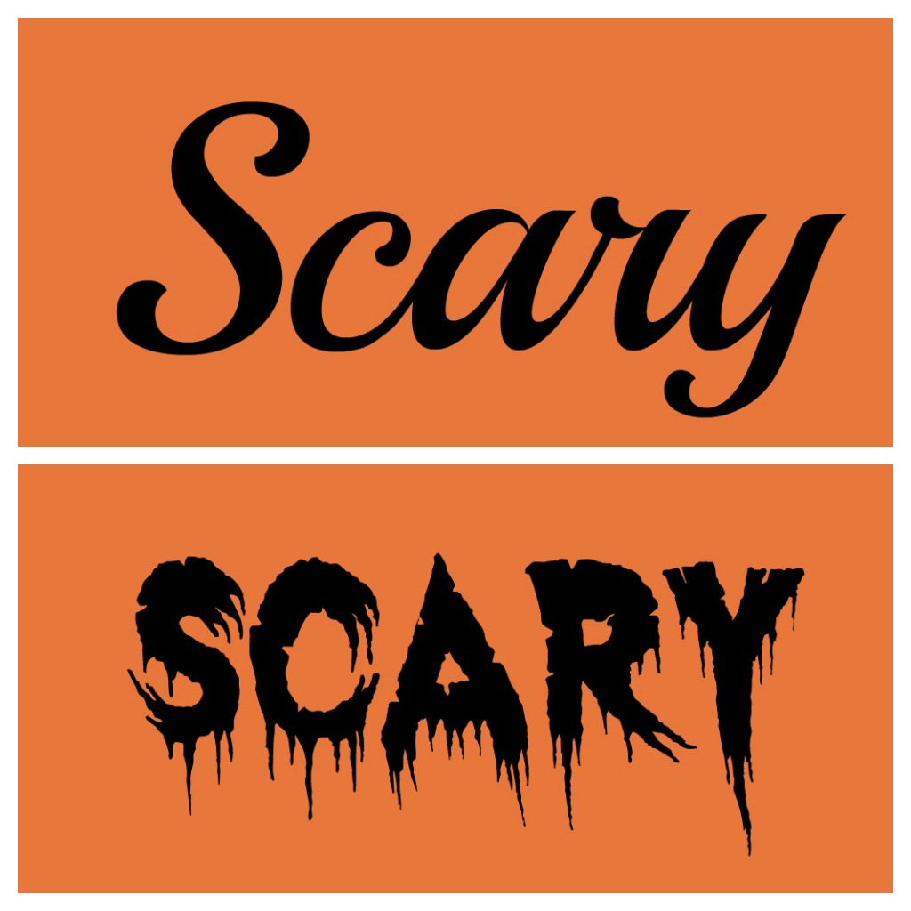
http://vimeo.com/49556689The video is a great representation of how fonts play into relaying a message. Finding a lettering style that matches what you want to convey is something that designers do very well. They choose the font that best tells your story and fits your brand. Here’s a great example of the word scary displayed in two different fonts.
The choice of font makes a bigger impact in the lower photo because it also displays the feeling that goes along with the word. Your artistic font choice gives your text a voice. Make sure to consider what your text says when picking a font. It can put emphasis on the message you want others to read and understand.
Finding Fonts Fascinating?
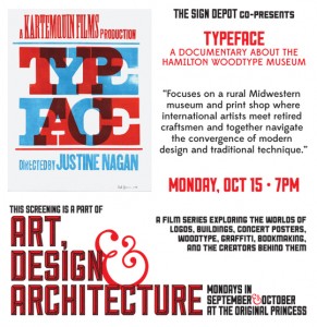
Then join us at the screening of the TYPEFACE Film. Happening October 12 2012 at 7pm in Waterloo Ontario’s Princess Cinema.
Watch the trailer on our post The Sign Depot Presents Typeface and purchase your tickets.
Becoming a fan of fonts? See how to use them in artistic sign design from both a signage point of view in the links in this posts and look for upcoming blogs on the topic.


