class="tag"Posts Tagged ‘typeface’
Artistic Sign Design – Finding The Font
Find The Font That Fits
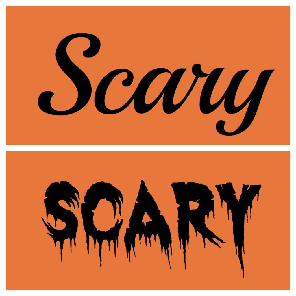
There are so many factors when it comes to artistic sign design. Logo colours, graphics and text are all important elements of custom sign creation. With all these variables it is often the choice of font that helps unify the overall look of the sign. When it comes to displaying company names and branding messages it is important to find a font that fits.
Favorite Fonts For Designers
We took to twitter and asked our followers what their favorite fonts are.
What is your favorite #Font ? #design — The Sign Depot Inc (@TheSignDepot) June 26, 2013
As you can tell by typography fan responses there are lots of great fonts to choose from. We were then asked about the favourite fonts of The Sign Depot. Below are choices from our experts in sign design.
Peter’s Picks
Peter is the Owner/President of The Sign Depot Inc. If you come by our workshop many of the signs and artistic sculptures on display were created by Peter.
- Fute Bold
- Garamond
- Snell Bold
Ben’s Picks
Ben is the head of our vinyl department and also goes by the nickname of the Vinyl Master. He know how to best display all your window graphics, vehicle decals, and temporary signage
- Euro
- Flash
- Aura
Adam’s Picks
Adam is our Lead Designer. If you are looking for custom business signs, logo design and/or sign package consultations, Adam is your guy. Watch for upcoming posts about Adam’s design work.
- Geared Slab
- Lobster
- Duke

Artistic Signs Of Intelligent Life
Maryse Maynard Exhibit – Signs Of Intelligent Life
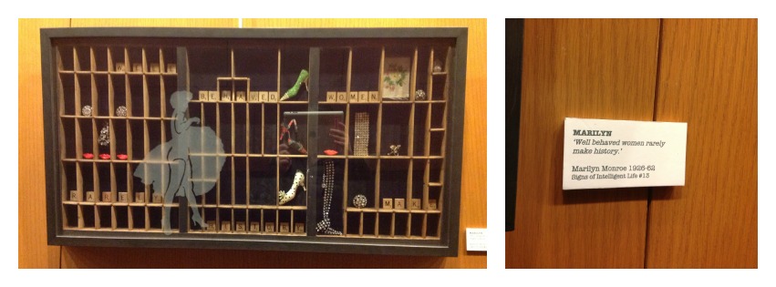
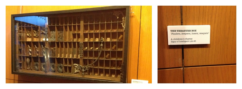
The City Of Kitchener Rotunda Gallery is featuring an exhibit called Signs Of Intelligent Life. Of course with the words signs in the name it peaked some interest. The exhibit was artistic mix medium show. It displayed printing press racks as shadow boxes influenced by famous sayings and quotes. It was an artistic sign showing a visual of the how the words influenced artist Maryse Maynard. You can read more about the artist and the ideas behind Signs Of Intelligent Life on her artist statement post.
Artistic Ideas
The words in these art pieces were displayed using scrabble pieces, clay tiles and what looked like routered wood letters. Below are two pieces that show how the phrases were created with Scrabble letter tiles.
Out Of The Box Thinking
The use of printing press tile boxes reminded me of the TYPEFACE film we presented last year at the Princess Cinema and how the skill of Wood Type printing could have been lost if it had not been for a Museum trying to keep it alive. Through the movie you learned how new artists are choosing to use wood type printing in new pieces, and in the case of this exhibit the item that holds the wood type letters was re-purposed into an artistic piece.
This brought me back to The Sign Depot workspace where Peter has an antique typeface holder displayed in his office. Every time I look there is an addition of items no longer available nowadays. Separately they look like items from days gone by, but together they look like a collection. It is almost as if these items are being re-purposed to make a brand new art piece right here in our workspace.
Looking at it now I wonder what phrase Maryse Maynard would choose for this display? Many come to mind for me, but I think the one that stands out is
Everything Old Is New Again
The Sign Depot Presents TYPEFACE
TYPEFACE Explores The Custom Typography Community
We are thrilled to be partnering with The Princess Cinema to present the TYPEFACE screening happening Monday October 15th in Waterloo Ontario. Find out more about typography, type setting, lettering and it’s role in the information age. Designers and artists will enjoy the idea behind this movie and it will be interesting to see how it many will have a connection to this unique film.
There is a lot of buzz about this movie and we want to share excitement by giving away a pair of ticket to the screening!
a Rafflecopter giveaway Want to ensure you get to see the film? Then grab a ticket over at the Event Page.
Want to know more about TYPEFACE? Interested in typography and letter setting? Perhaps you are just looking for a different kind of film based around history and its influence on modern day techniques. Take a look at the info listed from The Princess Cinema’s event page.
Typeface focuses on a rural Midwestern museum and print shop where international artists meet retired craftsmen and together navigate the convergence of modern design and traditional technique.A Part of the Art, Design & Architecture film series in September & October at the Original Princess. All seats $10. A special series pass that offers admission to all 8 films in the series is available for $70. The discussion of this film’s arrival is causing quite a stir in a community filled with design/art and culture. We hope you will join us Oct 15th at The Princess Cinema as we introduce the TYPEFACE film to the Kitchener Waterloo area. Let us know if you are attending by sending us a tweet, or posting on our facebook page. This film is bound to influence the audience. Make sure you are part of it.


