class="tag"Posts Tagged ‘paint’
The Sign Depot Revamps the Look of Restaurant Signs with Their Rust Finish Signage
Over the years, The Sign Depot has perfected the art of rust finishing signs using a custom finishing process. It is a multi-step paint finish that requires steady hand when it comes to achieving the distressed look required for each custom sign. This trend has since caught fire in the restaurant industry, changing the sleek chrome look to create more of a vintage look in many establishments. At a time where businesses are constantly looking to find ways to be unique, the distressed look rust finish trend gives restaurants a one of kind sign that helps them stand out from others in their industry. By using their signage as a focal point for the area, it attracts both current and potential customers to their locale and it serves as a 24 hour advertisement for their business. Below are four examples of restaurant signs that were given a distressed look by The Sign Depot.
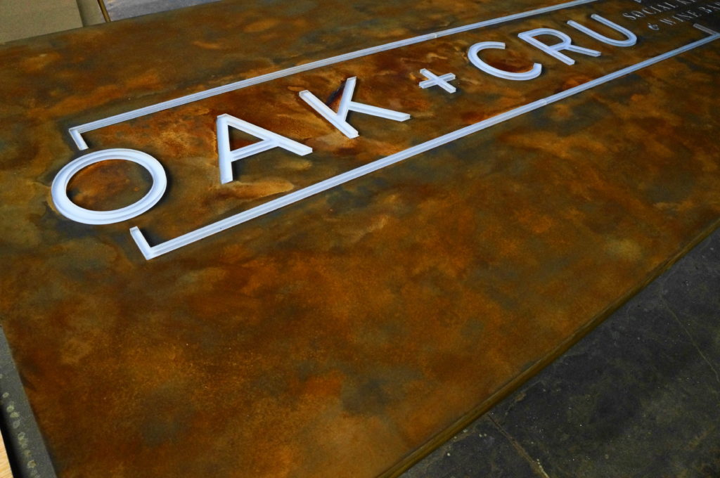
OAK + CRU Social Kitchen and Wine Bar
The sign for Kelowna British Columbia’s OAK + CRU Social Kitchen and Wine Bar is a mix of modern and vintage all in one sign. The juxtaposition between two eras in one sign was crafted through a mix of metal, rust and LEDs. It was created as welded metal sign box with cut outs for the letters. The sign was then fit for lit LEDs to light up the cut out areas. It was then given an all over rust finish creating a unique exterior showpiece for the local hot spot.
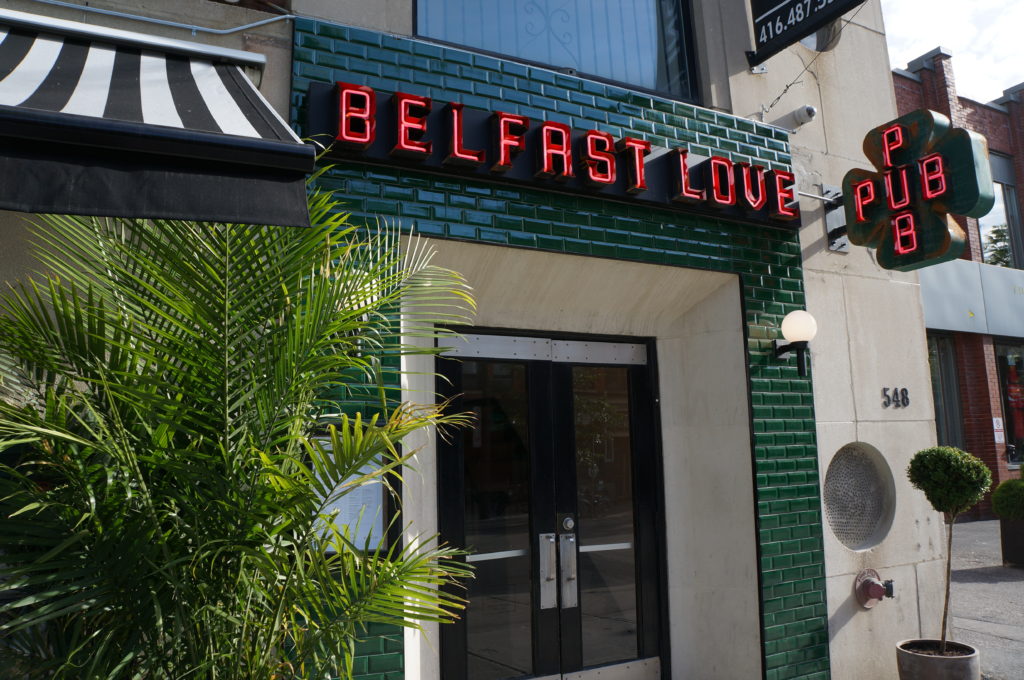
Belfast Love Public House
Belfast Love Public House in Toronto Ontario is branded as “A Proper Pub” and in turn required signage that reflected that statement. As a new restaurant in Toronto they knew they would have to get lots of eyes on their building and establish themselves as the top of mind place to be for traditional pub fare. This signage project required open can letters with neon tubing along with a paint and distressed finish to achieve authentic the look that the restaurant was going for. In this case the rust finish was strategically placed on the lit sign to create a patina look. For this project an exterior sign for the front entrance and a projection sign were created to catch the attention of both vehicle and foot traffic. The result is pub signage that looks like it’s straight out of Ireland.
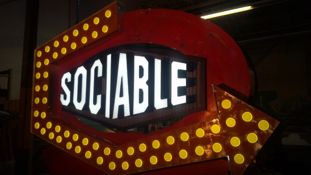
Sociable Kitchen + Tavern
Retro is all the rage at Sociable Kitchen + Tavern’s Brantford Ontario location. So much so that their sign is actually a retrofit of sign that was already on the property. This multidimensional sign has several components to recreate the look of a vintage marquee sign. This project included refinishing the sign base to represent the look of an aged tin sign, LEDs faced with acrylic ovals to represent lit light bulbs, high density urethane that was CNC router cut to match the texture of a sea can shipping container, individual lit can letters for the restaurant name and a changeable message board to interact with their local clientele. The rust finish was the tie in that brought all of these items together. It created the retro look that Sociable Kitchen + Tavern wanted to achieve. Once combined, all these sign elements created a past meets present upcylced pylon sign that has quickly turned into a local landmark for the City of Brantford Ontario.
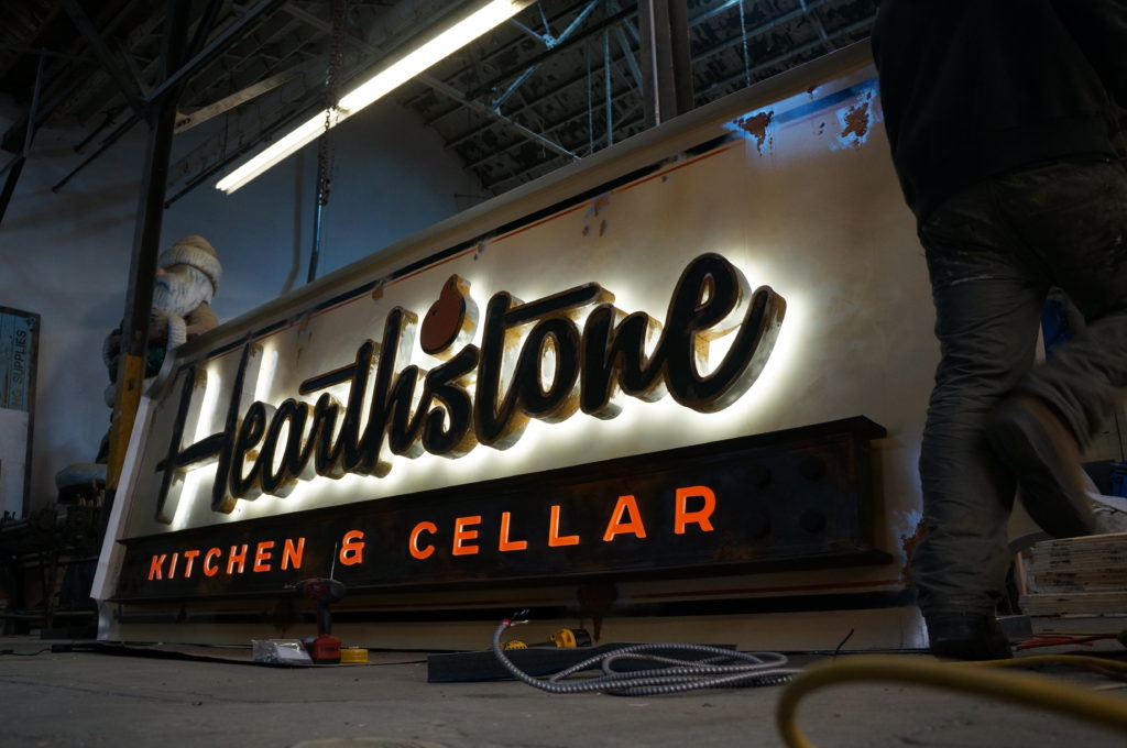
Hearthstone Kitchen & Cellar
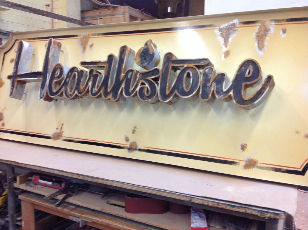
In Las Vegas Nevada, the best way to stand out from all the flashing lights is to come up with something completely different. In this case, the Red Rock Casino Resort & Spa wanted to replicate the look of a salvaged Gaslight Sign for their Hearthstone Kitchen & Cellar restaurant. In order to recreate this look a three dimensional metal sign with can letters for the word Hearthstone was crafted. The letters were then halo lit with LEDs to give off a backlit glow to best replicate the hazy lighting of gaslight sign. Below the restaurant name, individual push through clear acrylic letters with the words Kitchen & Cellar were attached to let additional light from the LEDs shine through. After all of those components were in place, the distressed rust finish was applied to the sign base as well as the text and graphics on the sign. The addition of the rust finished suggested that the sign could have been a salvaged sign from the Las Vegas sign graveyard.
As you can see from the images above, the rust finish on each sign is used differently depending on the style each restaurant wants to convey to the public. Finding the best fit for each establishment is something that the expert sign-makers at The Sign Depot specialize in. They can transform signage from being brand new to a very vintage look with various sign making techniques and paint finishes. By choosing the distressed rust finish for these restaurants signs, it took bespoke signage to the next level. As a result of this, it makes each of the restaurant signs stand out showpieces that attract clientele to their establishments. These one of a kind signs show the public that they are in for a unique experience by choosing to dine there.
The Sign Depot strives to not only be “on trend” in the sign industry but also creates trends with their custom crafted signage. As they say at The Sign Depot “A Good Sign Is The Sign Of A Good Business”
To learn more about these and other sign projects by The Sign Depot, be sure to visit the following links
Website: https://sign-depot.on.ca
Facebook: https://www.facebook.com/TheSignDepot
Twitter: https://twitter.com/TheSignDepot
Pinterest: https://www.pinterest.com/TheSignDepot
or visit our CONTACT US page for custom quote.
Custom Vehicle Graphics Are Not Just For Cars
Promotional Graphics For A Custom Food Festival Vehicle
Is your promotional vehicle giving your brand all the credit it deserves? David from Bread Heads decided very quickly that his Wood Fired Pizza Trailer needed to be branded better. He was already creating a lot of buzz at outdoor festivals with his unique trailer but quickly realized that highway travelers were taking a second look as he was towing it to or from the festival site.
Big Branding Design Decisions
David came to The Sign Depot for assistance in branding his promotional vehicle as well as his company Bread Heads. Without having a true logo for his business, Adam (Sign Depot Designer) was able to come up with a concept that would work as vehicle graphics and transfer well into custom business signage for David.
A Fully Customized Festival Vehicle
When we say fully customized we mean it featured custom designed vinyl vehicle decals and a custom paint finish achieved by Ben otherwise know as our Vinyl Master.
With the large white decal text on the red vehicle the info stands out very well.
For the upper part of the vehicle a vinyl stencil was layed down and painted over to use the negative space as a way to highlight the designed logo.
Following?
Are you following them on the road or following them on twitter? Either way the info relayed on this promotional vehicle will help you find out where Bread Heads is heading to next.
Having a clear message that can be relayed through signs gives passers-by a way to contact or connect with your business. If you wish to connect with us, leave a comment below, follow us on twitter or post on our facebook page.
Thanks to The Sign Depot for doing a great job on the trailer! Look for us on the road to Simcoe tomorrow. pic.twitter.com/evAO6iYf9d
— Bread Heads (@heybreadheads) August 22, 2013
We would love to help you with your vehicle graphics whether it be for one car, or a fleet of busineess vehicles. We think you’ll be happy with the results too!
Sculptural 3 Dimensional Signs – A Fish Out Of Water
or Finding Nemo At The Sign Depot
Over the last few weeks we’ve been watching a new character evolve. The beginning stages of the sign foam structure we best described as “Goldfish Cracker” shape. That day it was decided that we were now Finding Nemo at The Sign Depot
Watching A Sign Foam Fish Can Be Fasinating
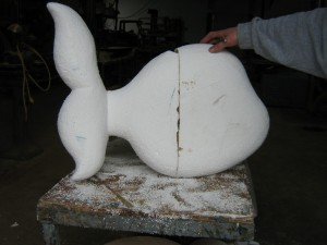
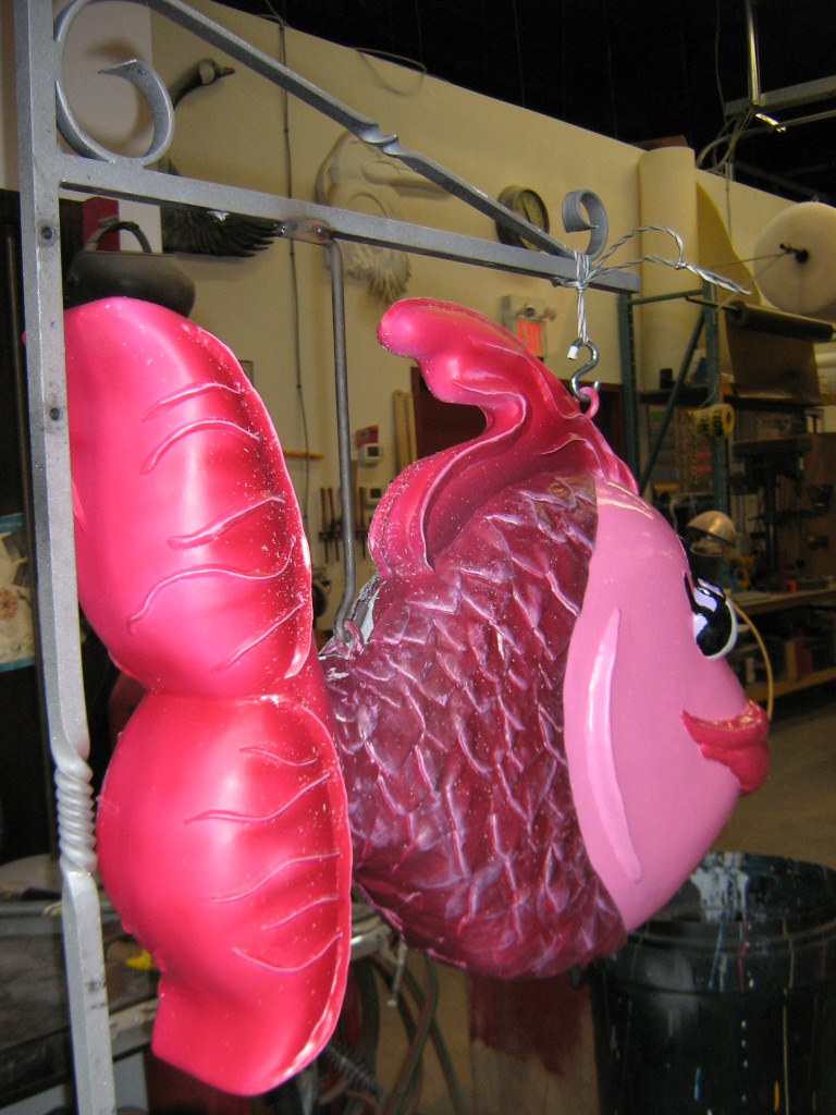
To give the sign dimension, sculptural scales were created by hand using a sculpting product and then applying it to the High Density Urethane (sign foam) surface. Then ripply fins, exaggerated eyes, Mick Jagger like-lips and bright coloured paint gave the fish the cartoon-ish look that the client was looking for.
Where will the Fuschia Fish find it’s final destination?
The sign is not for an aquarium, it’s an outdoor address sign. Address and Residential signs can be made to match your own personality, sense of style and/or uniqueness. You can decide on how subtle or stand-out you wish your residential sign to be. We can fully customize your outdoor address signs to your specification. It is always a good idea to have a few things in place in order for you custom sign to meet your expectations. Here are some great things to have prepared when contacting a professional sign designer.
Residential Signs – Where To Start
-
Begin with your favorite colours, pictures, pieces of art etc. all of these will help our professional sign designers create a look and feel that captures your style and taste.
-
Next decide on how large you wish the sign to be. Measurements are key!
-
Choose the text (if any) you wish to display on your sign.
-
Show us where it will be displayed. Take a picture of the area it will be installed. That way the designer will know what other objects are around the area for your custom sign, and can incorporate elements to match.
Whatever your desired scuptural address sign look is, these steps will help in the formation of what may be your guests first impression. OUTSTANDING!

