The Pantone Colour to Start The Next Decade is Classic Blue
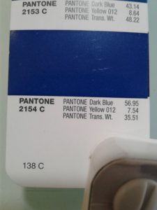
We always get excited at this time of year. Not only for the seasonal celebrations and Christmas holidays, we also anticipate the arrival of the the trends for the new year. Pantone’s Colour of the Year is something we have blogged about for several years and this time it will be the colour that kicks off the next decade.
Classic Blue
The time has arrived for this year’s announcement. Pantone has released that the 2020 Colour of the Year is Classic Blue
Blue Skies
Whether it is for a Exterior sign, interior wayfinding or a cottage sign, blue brings a sense of calm. Being a cool tone it almost represents the saying “cool and collective”.
According to Pantone’s website they describe the colour as
Instilling calm, confidence, and connection, this enduring blue hue highlights our desire for a dependable and stable foundation on which to build as we cross the threshold into a new era.
If that is something you want conveyed, then it would be a great selection for you. It could relay your message as a trustworthy brand, as per Pantone’s messaging above.
Blue tones are often used in business signs and logos.

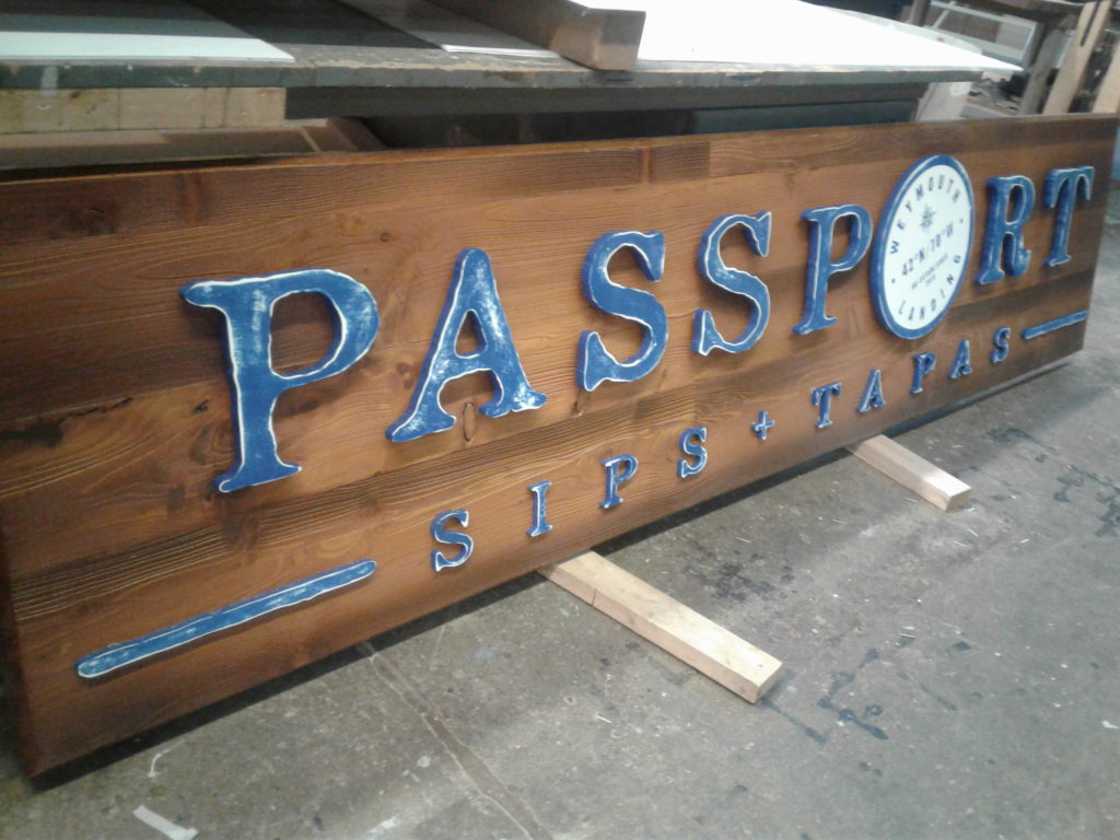
You can also see them in the skylines and bodies of water in our custom cottage signs.
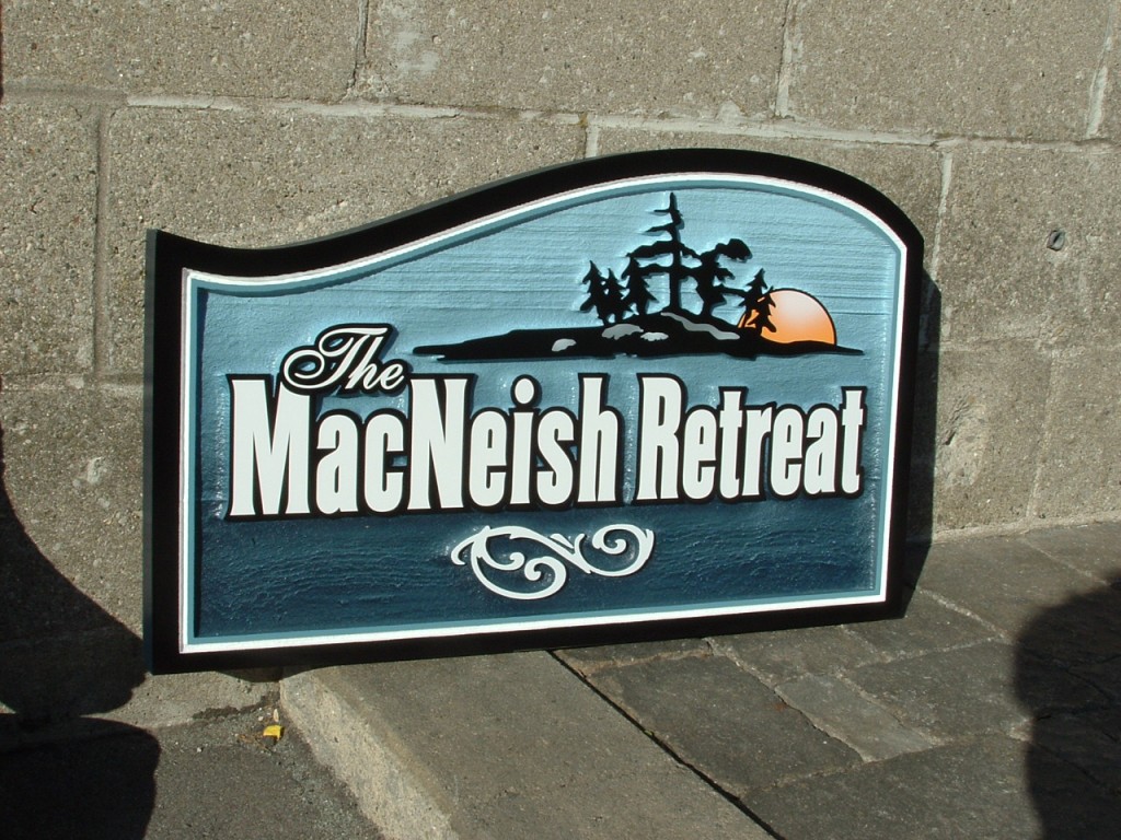
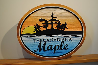
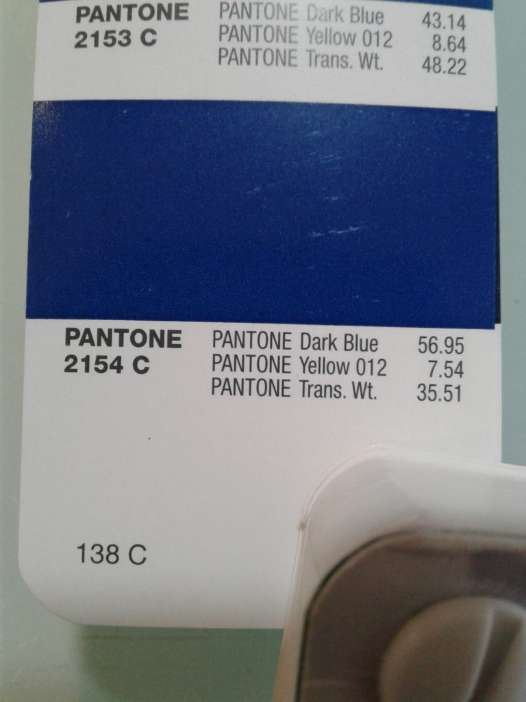
We use the Pantone matching system for many of clients, and according to Pantone the matching system chip is
PANTONE MATCHING SYSTEM™ –
Best Cross-Reference PANTONE 2154 C
Get Set for 2020
Now is the time to think about your 2020 messaging. In order to start off the decade with a great sign and visual marketing strategy, visit our CONTACT US page and connect with our expert sign designers. We want you to be thinking of the blue skies coming your way.
What do you think of this year’s choice? Let us know in the comments.
Leave a Reply
